Zolaa
Re-Branding and Logo design
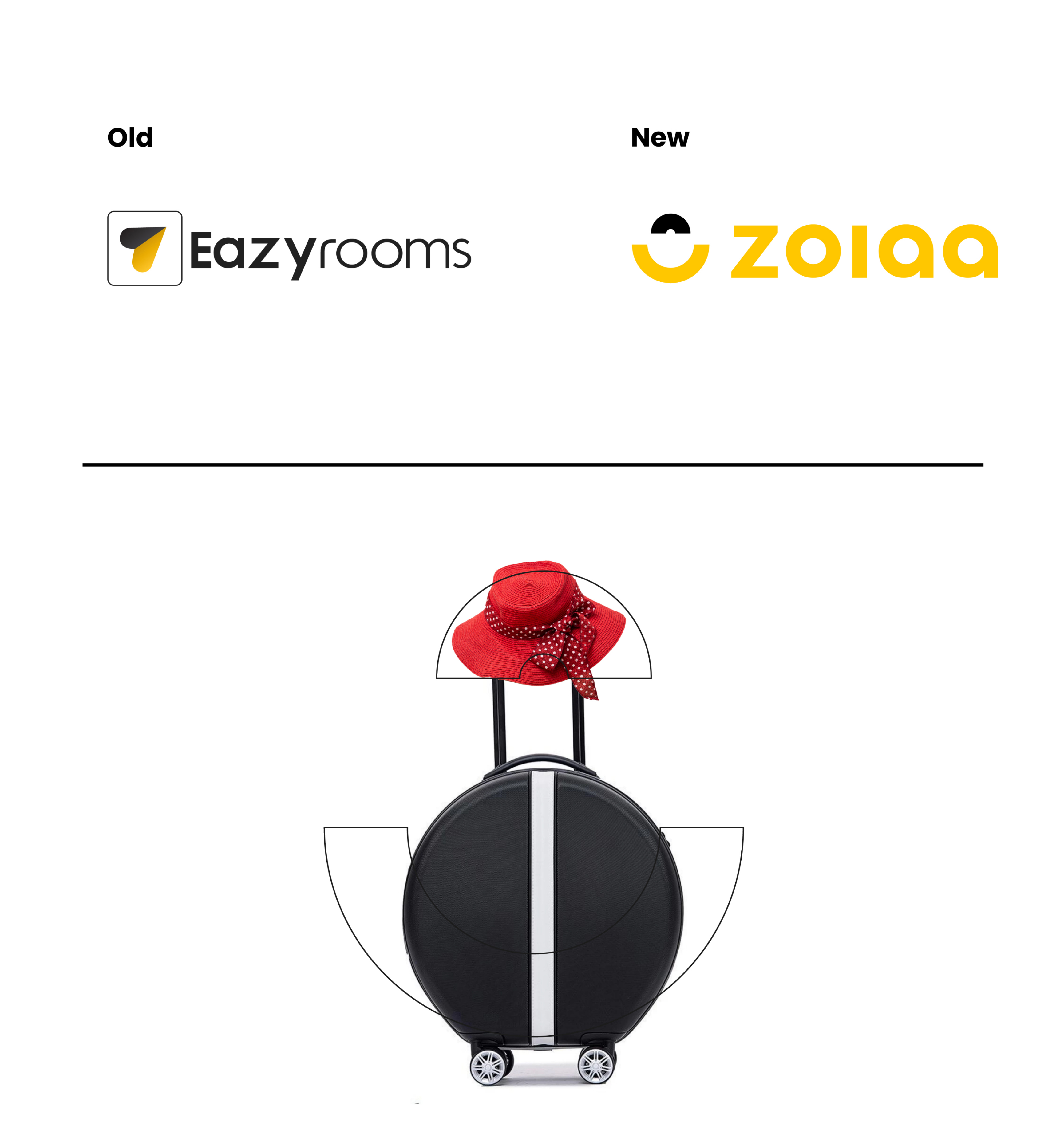
Zolaa is an Artificial Intelligence-based Personal Concierge to enhance the guest experience! They want to redesign their brand from “Eazyrooms to zolaa” because their mission has changed, they expanded their services from hotels to restaurents. So they changed their name to Zolaa.
About Logo
The idea of the main icon came from a travel bag. All elements of the logo, including the icon and typeface, are exclusively constructed using circles and lines..
About Colours
As this brand belongs to the hospitality industry, I aim to exude a cheerful vibe. The guests come to hotels to unwind and enjoy their leisure time, and I want to keep that positive energy flowing. To achieve this, I have chosen the color yellow as it perfectly conveys a cheerful mood. To complement the yellow, I've opted for black as the secondary color. However, I've avoided using pure black to minimize any potential eye strain that may occur when users read for extended periods.

The Path is the visual embodiment of the creative journey. It has no beginning or end. I’ve emphasized lines and the use of meandering paths and bold colors to create a graphic and eloquent personality that represents what Zolaa is about. The lines don’t have a beginning or an end because your journey is endless and evergreen. Use the path as a flexible design element. It can interact with the scene of a photograph, with bold type, or animate to create a new sense of depth.