Bunkwale
Branding and Logo design
Bunkwale, a budding petrol pump management startup, grappled with a critical challenge: the absence of a distinctive logo. In a saturated market, the lack of a visual identity hindered its ability to differentiate and leave a lasting mark. The goal was to create a logo that encapsulated the app's core functionality and conveyed a sense of reliability and innovation, essential for standing out in the competitive landscape.
Process
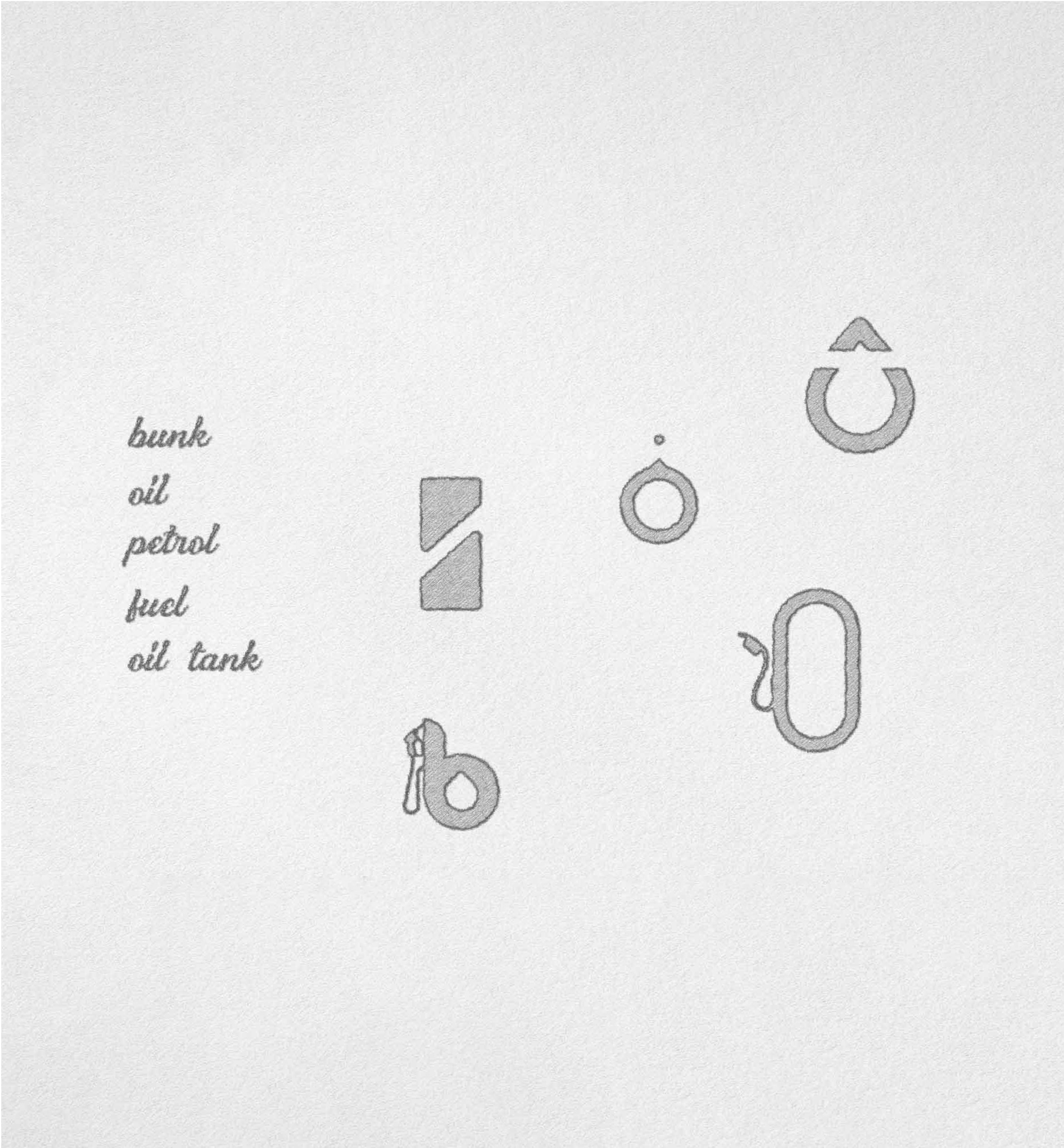
The logo design journey for Bunkwale involved a meticulous analysis of industry visuals. The concept focused on a seamless fusion of a fuel dispenser shape with the letter B, embracing simplicity and relevance. Orange and dark gray hues were chosen to strike a balance between energy and professionalism. Iterative design sessions refined typography and ensured scalability. Stakeholder feedback played a pivotal role, resulting in a logo that perfectly embodies Bunkwale's essence.
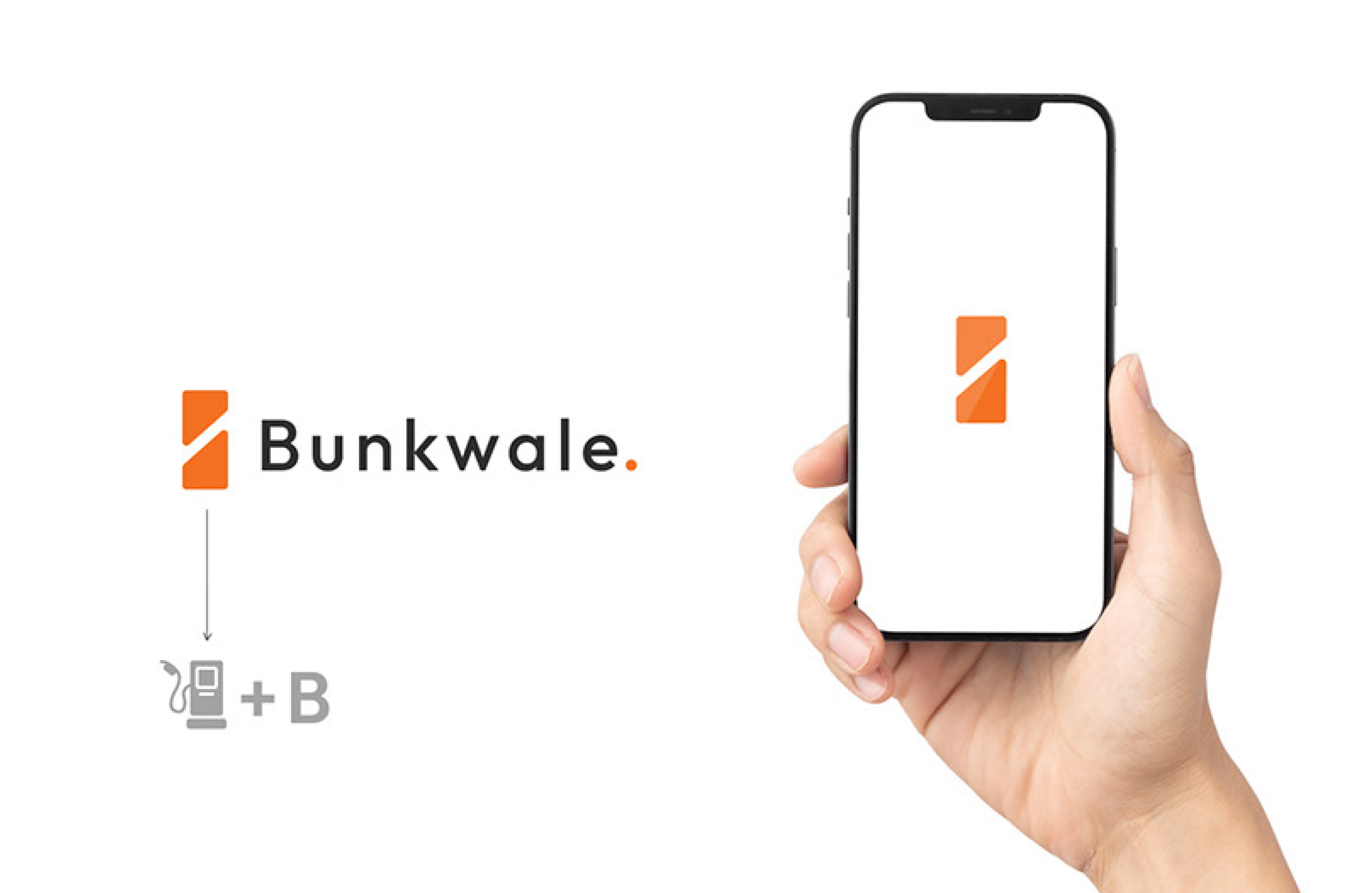
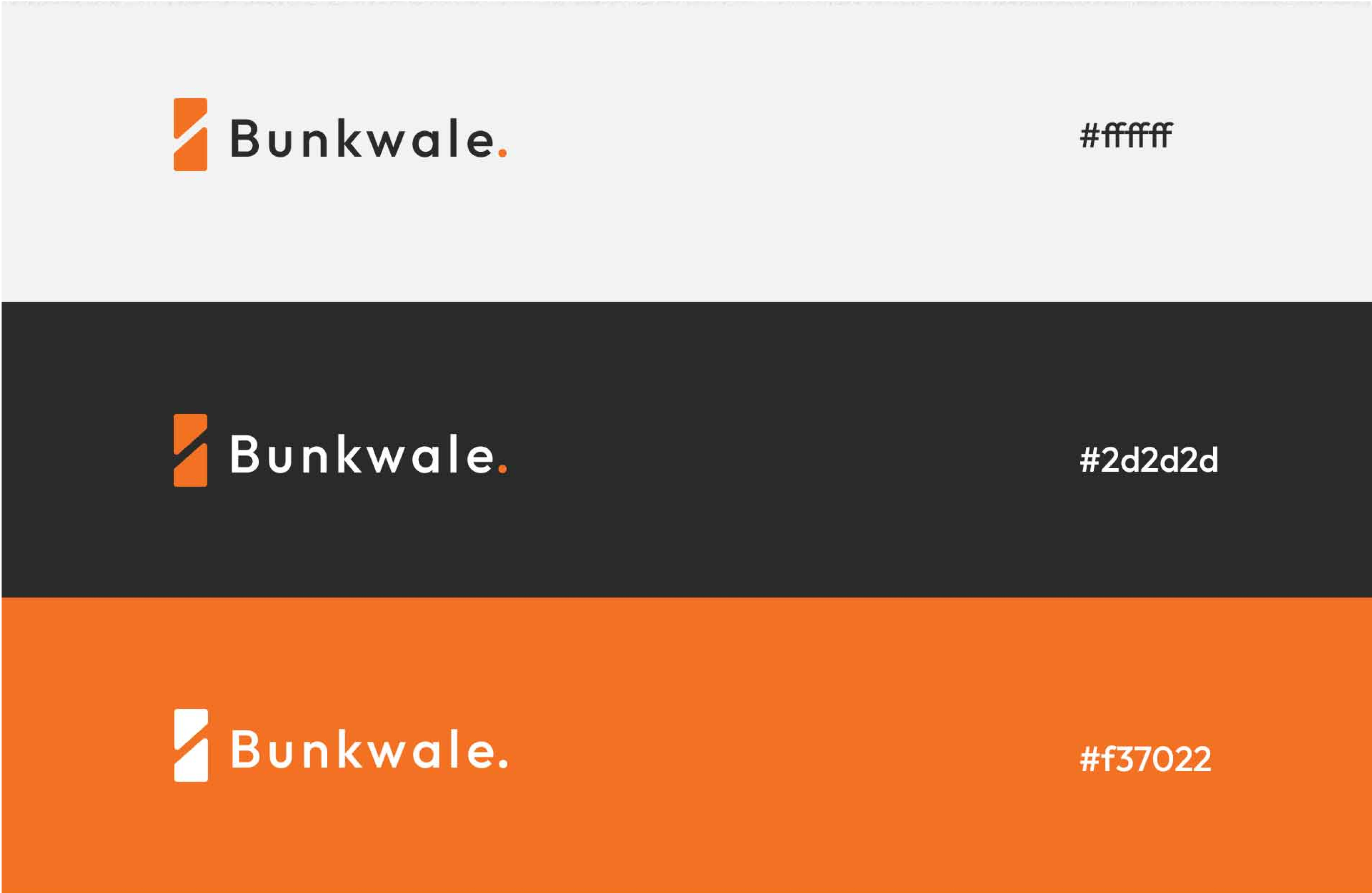
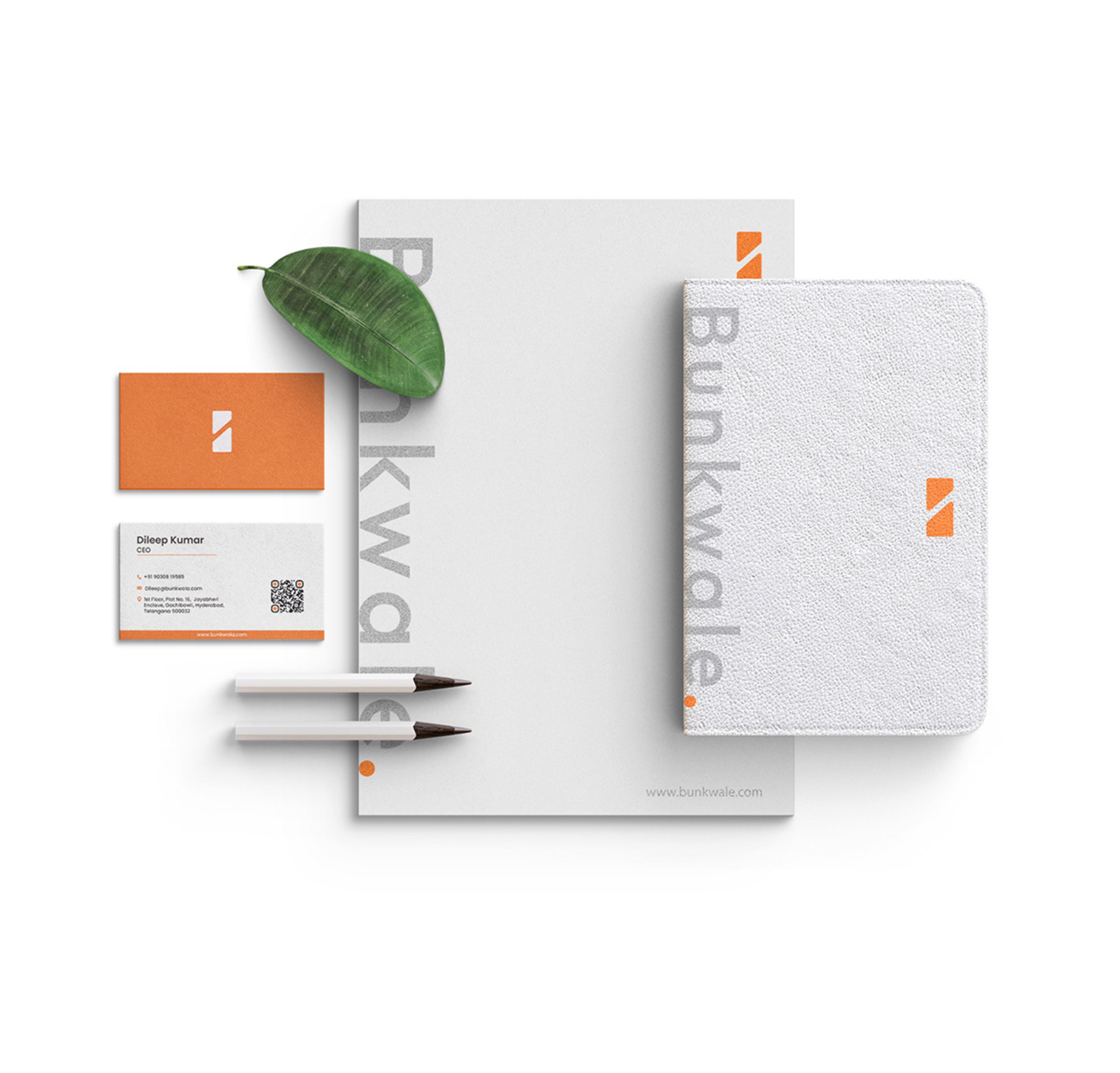
The final logo is a succinct solution to Bunkwale's branding challenge. A fusion of a fuel dispenser and the letter B communicates core functionality and modern efficiency. The orange and dark gray palette exudes energy and professionalism. This minimalist yet thoughtful design positions Bunkwale as a standout player, ready to make a lasting impression in the market. The logo establishes a strong foundation for brand recognition, embodying Bunkwale's values and creating a distinctive visual presence.