Kaizen
Branding and Logo design

Kaizen Soft Solutions, a growing software solutions provider, faced the challenge of creating a distinct brand identity that encapsulates their commitment to overcoming business challenges while fostering growth and safety. The task was to design a minimalistic yet powerful logo that resonates with their diverse clientele, ranging from small enterprises to large corporations.

Process
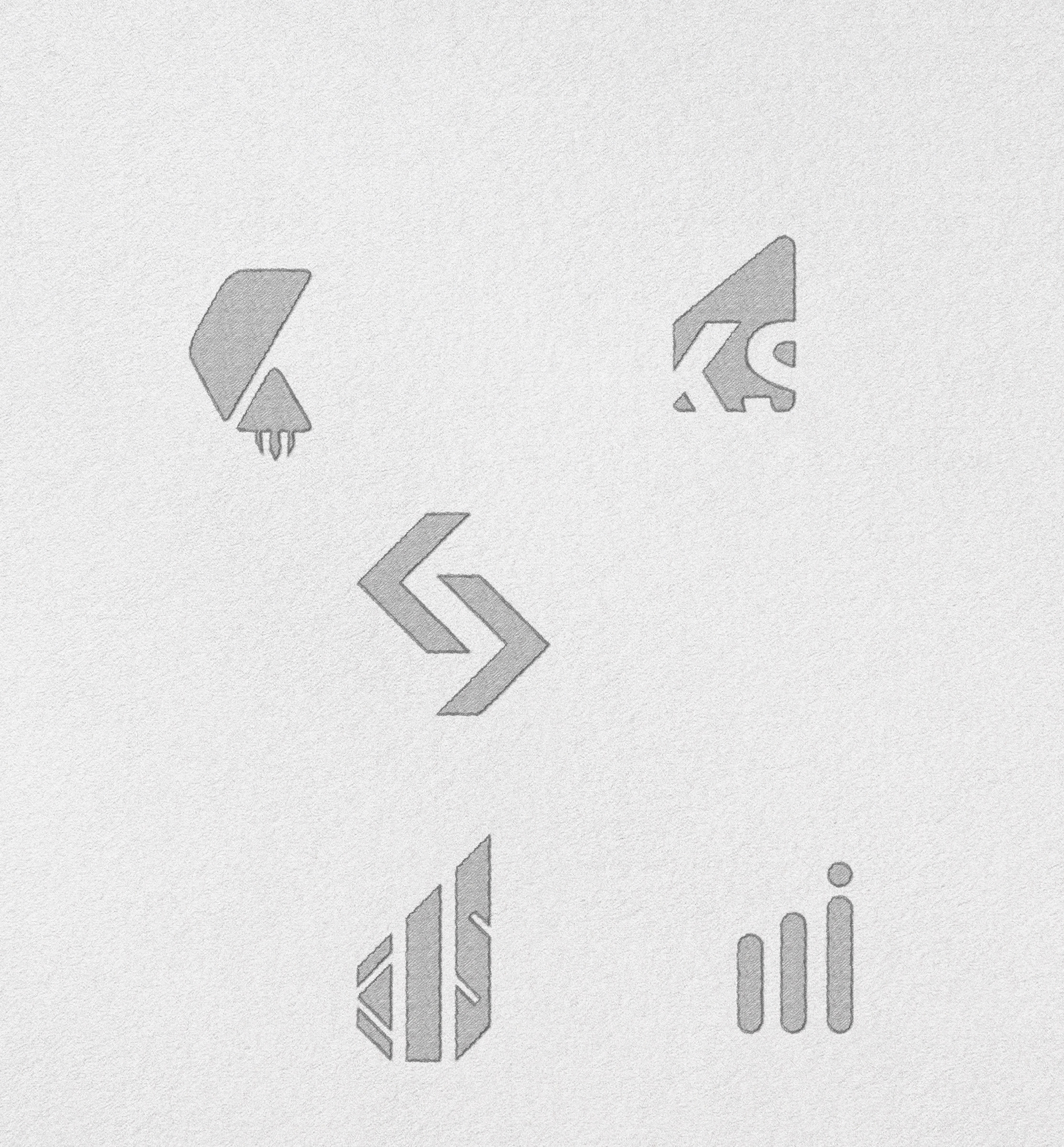
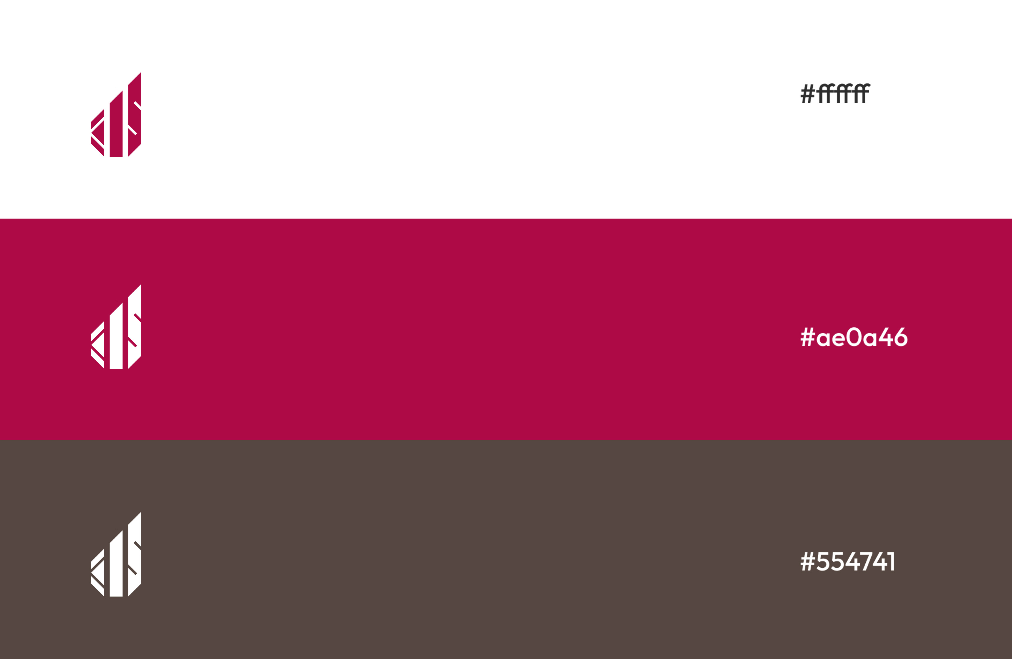
The branding process involved a meticulous and iterative design approach. Inspired by the Trident or Trisula, the iconography was streamlined to symbolize knowledge, desire, and action – crucial elements for business growth. The minimal color palette of French Wine and Brown Grey added sophistication and reliability, while the choice of clean and modern typography reinforced a contemporary feel. The design process focused on simplicity and clarity to create a logo that succinctly communicates Kaizen Soft Solutions' values.


The final solution is a minimalistic logo that serves as a potent visual representation of Kaizen Soft Solutions. The Trident-inspired icon elegantly communicates strength, knowledge, and action. The French Wine and Brown Grey colors add a touch of elegance and reliability. This minimalistic branding solution reflects Kaizen Soft Solutions' dedication to providing high-value software solutions, conveying trustworthiness and sophistication in a succinct visual statement.

